


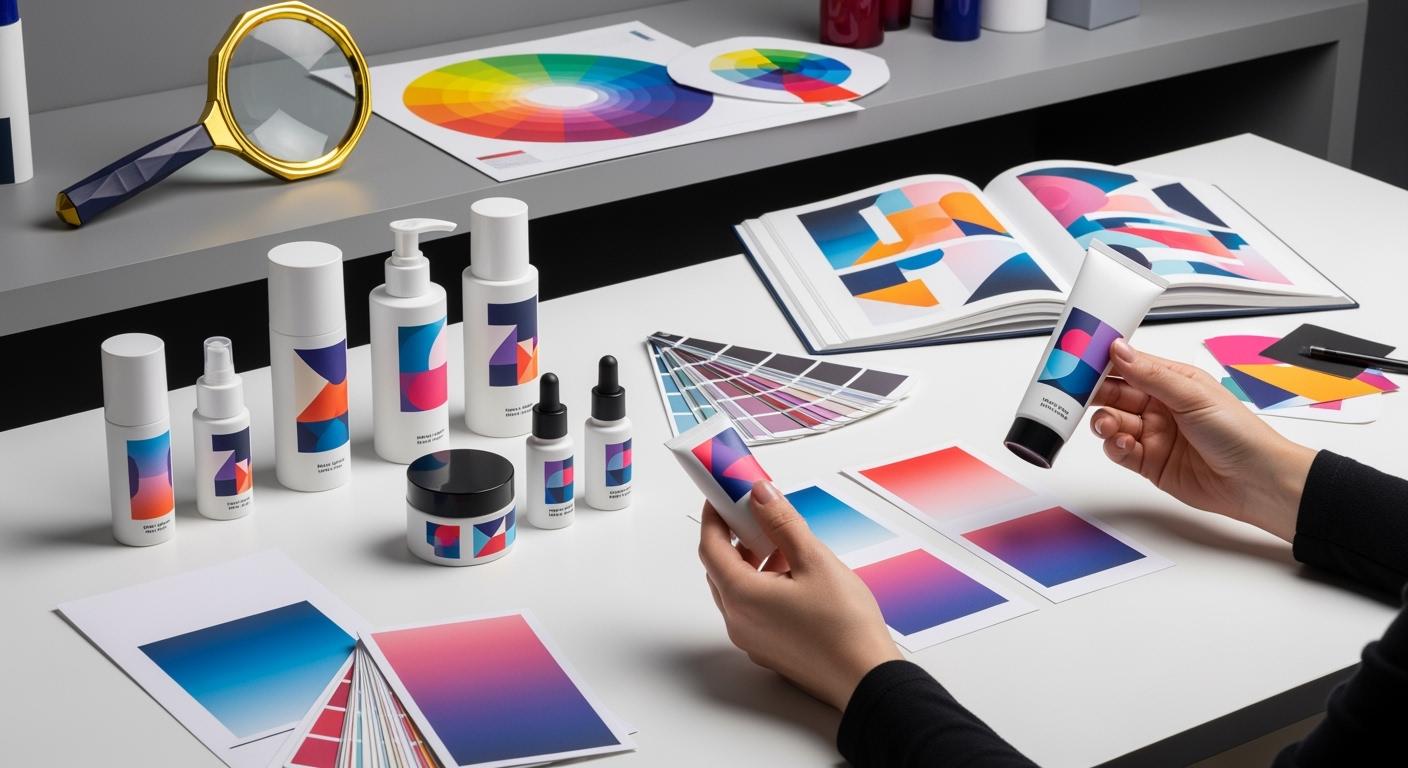
You know that keeping your brand the same is important when you pick custom cosmetic packaging. Color matching helps your brand stay strong. You use special tools and follow rules to get the right colors. Color matching makes your products look good in stores. If you want the best look, you should get color matching help from trusted suppliers. Custom color matching helps your ideas and makes your packaging easy to notice.
Key Takeaways
- Color matching is very important for a strong brand look in cosmetic packaging.
- Different materials can change how colors look, so always test colors on the real packaging material.
- Use the Pantone Matching System to keep color the same on all products and packaging.
- Check and write down color standards often to make sure each batch is the same and good quality.
- Talk clearly with suppliers about what color you want to stop mistakes and keep good quality.
Color Matching Challenges in Cosmetics
Material Differences
It is hard to get the same color on all packaging. The material you pick can change how the color looks. Here is a table that lists some materials and their problems:
| Material Type | Characteristics | Challenges for Color Matching |
|---|---|---|
| Glass | Sturdy, chemical reaction resistant | Expensive, fragile during transit |
| Plastic (PET) | Lightweight, inexpensive | Environmental waste, potential color distortion over time |
| Tin/Aluminum | Vintage design, various forms | Not suitable for liquids, rust potential with essential oils |
When you print on kraft, colors turn darker and more brown than on white. The base color always changes the final look. Inks soak into each material in different ways. This makes color matching harder.
Lighting and Perception
Light can change how you see color on packaging. A lipstick may look bright in sunlight but dull under LED lights. This is because different lights make colors look different. You should check samples in the same light as stores. This helps you match colors better and makes sure your products look right.
Ink and Coating Variations
Some PMS formulas use almost all opaque white and a little color pigment. Opaque white starts to turn yellow very fast. If you compare PMS Cool Grey #1 in your book with the ink from the can, they will not look the same. The color in your PMS book can change from the real ink color.
Factories use different ways to print, like CMYK or Pantone. This can make your packaging look different. If colors are not the same, your products may not look good. Keeping colors the same is important for luxury brands. You must control your pigments and coatings.
Batch Consistency
You want every batch to look the same. If batches are not the same, colors can be off and seals may not work well. You can use special tools to check if batches match. A Product Non-Conformity Tracker helps you find problems early and keeps colors the same. Checking suppliers and training workers also helps keep quality high and colors even.
Color Matching Steps and Tools
Pantone and Colour Matching
You need a good system to keep your brand colors the same. The Pantone Matching System helps you do this. Many cosmetic companies use Pantone guides. These guides help you pick trendy colors for your products. Pantone started in 1962 to help companies match colors better. When you use a Pantone chip, you get the same color everywhere. This keeps your brand colors strong.
Pantone colors work well for most packaging. But there are some limits you should know about.
| Limitation Type | Description |
|---|---|
| Higher Costs | Pantone colors can cost more than CMYK printing for big orders because of pre-mixed inks. |
| Matching Challenges | Some shades, like metallics or pastels, are hard to match on some materials. |
| Lack of Adaptability | Pantone does not work well for detailed gradients or photos that need CMYK. |
| Care for Guides | Pantone guides need careful handling to avoid fading or mistakes over time. |
You should use Pantone when you want strong colors and easy matching.
Setting Color Standards
You must set clear color rules before you start making products. This helps you get the right shade every time. You can use industry rules, special tools, and regular checks to make sure your packaging looks right. Here is a table that shows the main steps:
| Process | Description |
|---|---|
| Industry Guidelines | Follow ISO and FDA/EU REACH rules for safety and compatibility. |
| Professional Instruments | Use colorimeters and spectrophotometers for exact measurements. |
| Continuous Monitoring | Check often and talk with suppliers to keep standards high. |
| Batch Variation | Decide how much color can change between batches. |
| Supplier Communication | Work with suppliers to agree on what you expect. |
You need color measurement tools to check your pigments and make sure your packaging matches your rules. You should also talk with your suppliers about what color differences are okay. Color tolerance is a business agreement. You and your partners must agree on what is okay. If you do not set these rules, color matching becomes a guessing game. You may have problems and waste time.
Color Proofing and Sampling
You should always check samples before printing a full batch. Color proofing lets you see how your packaging will look. You can use eco-solvent inkjet systems because they work with many materials, even metallic inks. Some companies use special printers and software to get high color accuracy on the first try. For example, FlexoGrafix uses Kaleidoscope proofs with an HPZ2100 printer. CyberGraphics uses GMG ColorProof software to check dot patterns and metallic inks. These tools help you find problems early.
You need to focus on color accuracy when you check your samples. Always use the same material and finish as your final product. Closed-loop proofing systems help you keep your color matching steady. You should compare your samples to your color rules and keep testing until you get a good match. This step helps you avoid surprises and keeps your packaging looking sharp.
Adjusting for Substrates
Different packaging materials can change how colors look. You must adjust your color matching for each type of substrate. The right tools and software help you see how your colors will look on glass, plastic, or metal. Pantone spot colors help you keep your color strong during design. Color management software can turn Pantone colors into CMYK, taking the substrate and ink into account.
You can use programs like X-Rite Pantone to see your colors on different materials before printing. The Brand Color Assessment Profile program lets you check how well your colors match on each type of packaging. This helps you make smart choices early and keeps your color match cosmetics line looking the way you want. You should always use comparison samples to check your results. This step gives you confidence in your color matching and helps you deliver the best packaging to your customers.
Quality Control in Colour Match Cosmetics
Production Environment Controls
You have to keep your workspace steady to get the same color. If raw materials change, the color can change too. You need to check pigments and materials from all suppliers. Humidity and temperature can change how pigments mix and how ink dries. Keep the temperature around 260 °C for good pigment mixing. If the temperature goes up or down, the color may change. Humidity can also change how ink dries and how materials grow bigger. You must watch these things to keep colors right.
- Key environmental factors:
- Raw material changes
- Humidity and temperature
- Process steps like time and heat
You can use color tools to check your results. Using D65 daylight lighting helps you see the real color.
Communication and Documentation
You need to talk clearly with suppliers and write down every step. This helps you keep track of color and quality in packaging. You should use exact Pantone numbers for your brand colors. Label all equipment and containers with batch details. Check labels before you start labeling. Permanent codes on finished products help you track batches.
| Documentation Practice | Description |
|---|---|
| Weighing and measuring | Checked by another person, with clear labels on containers. |
| Equipment identification | Equipment and containers are labeled with contents, batch, and control info. |
| Label examination | Labels are checked for identity before labeling to stop mistakes. |
| Batch labeling | Equipment is labeled with identity, batch, and control info. |
| Permanent code marks | Finished packages have permanent codes for tracking. |
| Control records | Records are kept for materials, batches, and products, including tests and samples. |
You must train your quality control team to check color under the same light and angle. Set color tolerance ranges, usually Delta E values of 2.0 for important brand colors.
Ongoing Batch Testing
You need to test batches often to keep color the same. Do daily color bar checks and weekly calibration routines. For long-term checks, test every three months in year one, every six months in year two, and once a year after that. Fast testing uses three points, like 0, 3, and 6 months.
If you see color differences, you can fix them:
| Corrective Action | Description |
|---|---|
| Reprocess the Batch | Can you mix it again or adjust it? |
| Adjustments | Change pH, add fragrance, color, or emulsifier if safe. |
| Discard if Contaminated | If you find germs or toxins, throw the batch away. |
You must check samples from each batch to make sure they match your standards. This keeps your colour match cosmetics line looking good and protects your brand. Quality control helps you give the best packaging to your customers.
You can handle color matching in custom cosmetic packaging by using simple steps. Start with a base product that is always the same. Use tools to measure colors exactly. Pick color systems like CMYK and Pantone. Always check how materials and light change the color. Work with your partners and talk often to keep things clear.
- Good ways to match colors:
- Start with a big batch of plain base product.
- Use careful ways to measure colors.
- Think about materials and finishes.
- Use color systems everyone knows.
- Look at samples in different lights.
- Talk with design and printing teams.
| Case Study | Impact of Color Matching on Brand Success |
|---|---|
| Whole Foods | More people visited and liked the brand because of color-coded signs, which helped sales go up. |
| IKEA | Customers enjoyed shopping more because of smart color signs, and sales got better. |
If you use these steps, your cosmetics brand will stand out. Your packaging will look neat and catch people’s eyes.
FAQ
What is the Pantone Matching System (PMS) in packaging?
Pantone Matching System (PMS) is a way to talk about colors. It helps everyone use the same color words. This makes sure your packaging colors always look the same. PMS stops color mistakes and keeps your brand looking strong.
Why do colors look different on various materials?
Glass, plastic, and metal all show color in their own way. Each material changes how light bounces off it. This makes the ink look different on each one. You should always test your color on the real packaging.
How can you check if your packaging color matches the standard?
Use a colorimeter or spectrophotometer to check your sample. Look at the numbers and compare them to your color standard. If the numbers are close enough, your color is right.
What should you do if a batch color does not match?
- Check your color measurements again.
- Change the ink or pigment if needed.
- Test the color before making more.
- Ask your supplier for help if you need it.
Can lighting affect how you see packaging colors?
Yes, lighting can change how colors look to you. Store lights, sunlight, and office lights all make colors look different. Always check your samples in the same light as the store.