

The most influential skincare aesthetic decision you will make has nothing to do with your formula, your logo, or your campaign photography. It happens at the resin selection stage, months before your product reaches a consumer, when a factory technician chooses between a matte PP substrate and a frosted PETG one. That single decision shapes whether your brand reads as clinical, premium, eco-conscious, or apothecary before anyone unscrews a cap.
If you are building a skincare line, your packaging aesthetic is not a downstream design task. It is a manufacturing specification that must be locked before tooling begins. This guide breaks down the five dominant aesthetic languages in skincare packaging, the materials and decoration techniques that produce each one, and how to translate your visual vision into a sourcing brief that a cosmetic packaging manufacturer can actually execute.
The Five Dominant Skincare Aesthetic Languages
Every skincare brand on a retail shelf or in an Instagram flat-lay speaks one of five visual languages through its packaging. Each language requires a specific combination of material, finish, color, and form factor. Choosing the wrong combination sends a contradictory signal that confuses consumers and undermines brand positioning.
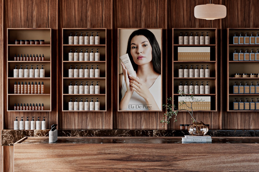
Clinical / Dermatologist Aesthetic. Matte or semi-matte surfaces, a black-and-white color palette, airless pump dispensing, and minimal label typography. Brands like The Ordinary, SkinCeuticals, and Medik8 use this language. According to Dezeen, The Ordinary built premium perception at mass-market pricing through clinical matte packaging, ingredient-as-branding typography, and the deliberate removal of decorative elements rather than addition of them.
Clinical aesthetic packaging is a design system characterized by matte or semi-matte surfaces, black or white color palette, airless pump dispensing, and minimal label typography. Associated with dermatologist brands and science-led formulations, clinical packaging achieves premium perception through restraint. The substrate is typically matte PP, whose non-reflective surface reads as pharmaceutical, driving consumer trust in ingredient efficacy.
Clean Beauty / Minimalist Aesthetic. White or nude tones, frosted or soft-touch finishes, ingredient-led labels, and round or cylindrical forms. Glossier defined this category. According to Vogue Business, Glossier built its entire packaging identity on the “your product, elevated” principle, with minimalist frosted tubes and type-forward labels driving 80% of customers to cite packaging as their brand affinity driver.
K-Beauty / Glass Skin Aesthetic. Gradient colors, high-gloss or pearl finishes, slim form factors, and pastel palettes. K-beauty packaging drove the global association between minimalist design and perceived formula efficacy. According to the Korea Institute for Industrial Economics and Trade (KIET) 2024 export report, brands using clinical minimalist packaging showed 2.3x higher consumer-perceived efficacy scores versus equivalently formulated products in decorative packaging.
Apothecary / Luxury Aesthetic. Amber glass or PETG, serif typography, dark earth tones, and embossed or debossed elements. Aesop is the benchmark. According to the Financial Times, L’Oreal acquired Aesop for $2.53 billion in 2023, a valuation built substantially on apothecary packaging that commands 2 to 4 times the premium over comparable formulations.
Eco-Conscious Aesthetic. PCR material, bamboo composite components, kraft labels, and mono-material structures. This language treats sustainability itself as the primary aesthetic signal. According to the Ellen MacArthur Foundation’s 2024 New Plastics Economy report, mono-material packaging in all-PE or all-PP structures is increasingly used as visible brand marketing, with brands printing recyclability claims on-pack and letting the sustainability message serve as the primary design element.
Color Language in Skincare Packaging: 2025 to 2026 Palette Trends
Color is the fastest-read aesthetic signal on a shelf. Before a consumer registers your logo or reads your label, their brain processes your packaging color and makes an instant category judgment. Getting this wrong puts your product in the wrong mental bucket.
According to the Pantone Color Institute’s 2025 announcement, the Color of the Year is Mocha Mousse (PANTONE 17-1230), a warm grounding brown tone forecast to drive skincare packaging toward earth-tone “wellness luxury” aesthetics through 2025 and 2026. This follows the broader shift from cool Millennial pink (2016 to 2020) to warm, grounded neutrals as the dominant palette in premium skincare.
Here is how the current color trends map to packaging specifications:
| Color Trend | Aesthetic Signal | Typical Material / Finish | Best Suited For |
|---|---|---|---|
| Mocha Mousse / warm earth tones | Wellness luxury, grounding | Tinted PP or PETG, matte finish | Natural / botanical skincare |
| Greige and putty tones | Modern sophistication | Soft-touch coated PP, satin finish | Premium clean beauty |
| White with warm undertones (cream, ivory) | Clinical clean | Matte or semi-gloss PP | Dermatologist brands, clinical lines |
| Matte black | Clinical luxury | Black-pigmented PP, soft-touch coat | Active ingredient serums, retinol, vitamin C |
| Gradient / ombre pastels | Youthful energy, K-beauty | Multi-pass screen print on PETG or PET | Gen Z targeted, K-beauty inspired |
According to WGSN and Coloro’s Color Forecast 2025-2026, greige and putty tones are the fastest-growing color family in premium skincare packaging, up 44% in new launches since 2023, replacing the Millennial pink era. Meanwhile, according to Euromonitor’s Beauty Packaging Trends 2024, white with warm undertones now accounts for 38% of premium skincare packaging, up from 28% in 2020, driven by the clinical-clean aesthetic trend.
Materials That Communicate Different Aesthetics
Material choice communicates aesthetic intent with precision: frosted glass or frosted PETG signals premium purity, matte PP signals clinical efficacy, bamboo composite signals eco-commitment, and PCR content with visible grain signals sustainable authenticity. Each material choice is also a sourcing decision with distinct cost and MOQ implications.
Frosted PETG vs. Frosted Glass. According to Packaging World, frosted or sandblasted PETG bottles can achieve a near-glass tactile experience at 60 to 70% lower weight, making them the primary alternative for brands wanting premium aesthetic without glass fragility. Frosted glass typically commands a significant retail premium over plastic equivalents, but the perception gap closes dramatically when PETG receives proper surface treatment. For brands shipping internationally, the weight savings on PETG compound across every container in a shipment.
Matte PP: The Clinical Workhorse. According to the Society of Plastics Engineers (SPE) Beauty Packaging Annual 2024, matte polypropylene is the dominant material for clinical aesthetic skincare packaging. Its non-reflective surface reads as pharmaceutical and medical, driving consumer trust in ingredient efficacy. PP also accepts soft-touch coating, hot stamping, and screen printing, making it the most versatile substrate for decorated clinical packaging.
PCR Materials: Eco-Authenticity. Post-consumer recycled plastic has a characteristic slight transparency variation and sometimes a slight gray-beige tint. According to Sustainable Brands, brands are now marketing this natural imperfection as an aesthetic feature, treating the visible grain as an eco-authenticity signal rather than a defect. Oulete offers PCR content at 10 to 50% across PP, PE, and PET resins, enabling brands to dial in their sustainability positioning at the material specification stage.
Airless Pump Formats. According to Packaging Strategies, airless pump bottles are the number-one format associated with clinical premium skincare aesthetics, signaling formula protection and medical-grade dispensing to consumers. The vacuum mechanism also eliminates the need for preservative-heavy formulations, which aligns with both clinical and clean beauty aesthetic positioning.
Decoration Techniques That Elevate Packaging Aesthetics
The substrate is the canvas. Decoration is the brand expression. Five techniques dominate premium skincare packaging, and each creates a distinct aesthetic outcome.
Soft-touch coating, also called velvet coating or rubberized matte finish, is the number-one requested decoration technique in premium skincare packaging. According to the Luxe Pack Monaco 2024 Post-Show Report, 68% of packaging decorators surveyed cited soft-touch as their most-requested finish. Applied to PP or ABS substrates via spray or roll coating, it creates tactile premium perception. Soft-touch transforms an ordinary PP bottle into something consumers want to hold, and that tactile engagement translates directly to longer shelf interaction time.
Hot Stamping and Metallic Foil. According to AWA Alexander Watson Associates, gold, silver, and rose gold foil stamped onto matte packaging surfaces creates “luxury contrast” aesthetic, and it is the fastest-growing decoration technique in premium skincare packaging from 2022 through 2024. The combination of matte substrate with metallic accent is the simplest way to move packaging from “clean” to “premium clean.”
Gradient Screen Printing. According to Cosmetics Design Asia, gradient and ombre finishes in skincare packaging grew 127% in brand adoption from 2022 through 2024, particularly in K-beauty and Gen Z-targeted lines. This technique requires 2-color to 4-color multi-pass screen printing with precise registration, adding 5 to 7 days to standard production lead time. The visual payoff is substantial for brands targeting younger consumers.
Frosted Mold Texture. Frosted appearance can be achieved through mold texturing, where the cavity surface is etched to create a frosted finish directly during molding, rather than through post-mold coating. This eliminates a processing step and can reduce per-unit decoration cost by 15 to 20% while maintaining consistency at scale. For brands ordering large volumes, specifying frosted texture at the mold design stage rather than adding it as a post-processing step is one of the most practical cost-saving decisions available.
Typography and Label Design as Aesthetic Signal
According to Dieline’s 2024 Annual Report on Type in Packaging, the font choice on skincare packaging is the single lowest-cost, highest-impact aesthetic lever available to brands. Typography does not require new tooling, different resins, or additional decoration passes. It happens at the label or print design stage, yet it carries enormous perceptual weight.
The mapping is straightforward. Sans-serif typefaces (Futura, Helvetica, custom geometric fonts) signal clean and clinical aesthetics. Serif typefaces (Garamond, custom oldstyle faces) signal apothecary and premium aesthetics. Script typefaces signal artisan and indie positioning. The Ordinary proved that ingredient-as-branding typography, where the active ingredient name dominates the label in clinical-style text, can create an entire brand identity without traditional logo-driven design.
Label material also matters. PP labels give a matte, understated finish. PS (pressure-sensitive) labels offer flexibility for short runs. No-label direct printing, where the brand information is screen printed or hot stamped directly onto the bottle surface, creates the cleanest aesthetic and eliminates label edges, wrinkles, and peeling over the product lifecycle.
Translating Aesthetic Vision into a Packaging Brief
This is where most brand founders hit a wall. They know what they want their packaging to look like. They have Pinterest boards, competitor references, and mood boards. But they do not know how to translate that visual direction into a specification that a packaging manufacturer can quote and produce consistently.
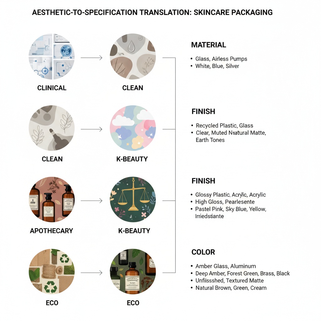
Here is an aesthetic-to-specification translation table:
| Brand Says | Manufacturer Needs |
|---|---|
| “We want a clinical, medical look” | Matte PP body, black or white cap, debossed logo, airless pump, no-label zone, sans-serif direct print |
| “We want premium but not heavy” | Frosted PETG, soft-touch coating, hot stamp accent, 30-50ml format |
| “We want K-beauty vibes” | High-gloss PET or PETG, pastel gradient screen print, slim cylindrical form, spray pump or dropper |
| “We want eco-forward” | PCR PP at 30-50%, bamboo cap or overcap, mono-material structure, kraft label |
| “We want apothecary luxury” | Amber PETG or glass, serif typography screen print, dark earth-tone color, embossed shoulder detail |
Before contacting a packaging supplier, answer these five questions:
- Which of the five aesthetic languages (clinical, clean, K-beauty, apothecary, eco) is your primary positioning?
- What is your target retail price point, and what packaging cost per unit supports your margin?
- What is your formulation chemistry (alcohol content, active ingredients, oil base)?
- What is your initial order volume, and what is your projected 12-month volume?
- Does your target market have specific material or recyclability requirements (EU PPWR, California SB 54)?
Answering these before your first supplier conversation eliminates weeks of back-and-forth sampling. Aesthetic consistency at production volumes above 10,000 units requires getting the specification right at the mold design stage, not at the decoration stage. Changing a mold texture is a tooling revision. Changing a screen print color is a press setup. The cost difference between those two changes is significant.
The Unboxing Aesthetic: From Shelf to Social Media
Skincare packaging no longer just needs to perform on a retail shelf or in a bathroom cabinet. According to Bazaarvoice’s 2024 Visual Commerce in Beauty report, 67% of skincare consumers photograph new purchases before using them, making the unboxing aesthetic a primary organic marketing channel. Packaging designed for the bathroom shelf must now also perform under smartphone cameras, in natural light, as a social media asset.
According to Mintel’s 2024 Beauty and Personal Care Report, 56% of Gen Z beauty buyers say they have purchased a skincare product they did not need because the packaging looked aesthetic. That statistic reframes packaging from a cost center to a customer acquisition channel.
According to Nielsen’s Beauty Retail Shopper Study, products with a consistent aesthetic “family,” meaning coordinated color, shape, and texture across SKUs, outsell single-product aesthetics by 28% in specialty beauty retail. For brands launching a multi-SKU skincare line, designing a packaging family from the outset is more cost-effective than retrofitting individual bottles later.
Brands like Glossier (minimalist frosted), Drunk Elephant (bold color-coded matte), and Aesop (amber apothecary) built billion-dollar brand identities on packaging aesthetic consistency. According to WWD Beauty Inc., Drunk Elephant grew to an $845 million acquisition by Shiseido in 2019, with packaging-driven brand identity cited as a primary value driver.
Sustainability as an Aesthetic Signal
Sustainability in packaging is no longer just a compliance checkbox. It has become an aesthetic category in its own right. The visible characteristics of sustainable materials, the subtle tint of PCR plastic, the texture of bamboo composite, the printed recyclability claim on a mono-material bottle, are now design elements that brands use intentionally.
According to Euromonitor’s Refillable Beauty Packaging 2024 report, refillable packaging grew 220% in new product launches from 2021 through 2024, driven by luxury skincare brands including Chanel, Dior, and La Mer. The refill pod format has evolved beyond utility into its own aesthetic category, with refill pods designed to be displayed on the bathroom shelf rather than hidden.
According to the Mintel GNPD 2024 Asia-Pacific Beauty Packaging data, bamboo composite components (bamboo fiber blended with PP) showed 156% growth in new skincare product launches using eco-aesthetic packaging in 2023 through 2024, particularly in the Asia-Pacific market.
For brands sourcing from China, the practical path is specifying PCR content percentage and mono-material structure at the initial briefing stage. Oulete supports PCR integration at 10 to 50% across PP, PE, and PET, allowing brands to select the exact sustainability positioning that matches their aesthetic direction and regulatory requirements.
Skincare aesthetic is not a style trend that lives on Pinterest boards. It is a manufacturing specification that must be locked into material, finish, and decoration choices before tooling begins. The brands that get their packaging aesthetic right are the ones that translate visual direction into production specs early, test samples with their actual formulation, and work with a manufacturer that understands how resin selection, surface treatment, and decoration interact to produce a coherent brand signal. Request a consultation with Oulete to translate your skincare aesthetic vision into production-ready packaging specifications.
Frequently Asked Questions
Q: What makes skincare packaging look aesthetic? Skincare packaging achieves an aesthetic through the deliberate alignment of five elements: material (glass, PETG, PP), finish (matte, frosted, glossy), color palette, form factor (bottle shape and proportions), and decoration (typography, printing, foil accents). Each element communicates a specific brand signal, and the five must work together to create a coherent visual identity.
Q: What is the “clean beauty” aesthetic in packaging? Clean beauty packaging aesthetic typically features white or nude color palettes, frosted or soft-touch finishes, ingredient-forward label typography, and simple cylindrical or round forms. The visual language communicates transparency and simplicity. Materials are typically matte PP or frosted PETG, often with PCR content to reinforce the sustainability association.
Q: How do I choose packaging that matches my skincare brand aesthetic? Start by identifying which of the five dominant aesthetic languages fits your brand: clinical, clean/minimalist, K-beauty, apothecary, or eco-conscious. Then translate that language into material specifications (resin type, finish, color), decoration requirements (print method, foil, coating), and form factor. Provide your packaging manufacturer with a visual brief alongside these technical specifications.
Q: What packaging formats are used in K-beauty? K-beauty packaging typically features slim cylindrical bottles, high-gloss or pearl finishes, pastel or gradient color palettes, and dropper or spray pump dispensing. Materials tend toward glossy PET or PETG. Gradient screen printing and delicate typography are common decoration choices. The overall effect prioritizes lightness, precision, and a clinical-meets-youthful visual language.
Q: How much does soft-touch coating add to packaging cost? Soft-touch coating, applied via spray or roll coating on PP or ABS substrates, typically adds a per-unit cost premium that varies by bottle size, surface area, and order volume. The technique was cited by 68% of packaging decorators at Luxe Pack Monaco 2024 as their most-requested premium finish. Contact your manufacturer for project-specific pricing based on your bottle geometry and volume.
Q: What is the difference between frosted glass and frosted PETG packaging? Frosted PETG achieves a near-glass tactile and visual experience at 60 to 70% lower weight than glass. PETG is shatter-resistant, reducing breakage during shipping and consumer use. Glass carries a higher perceived luxury signal on shelf, but the perception gap narrows with high-quality PETG surface treatments. PETG is the preferred choice for brands prioritizing durability, shipping cost, and international logistics.
Q: How do brands like Glossier and The Ordinary achieve their iconic packaging aesthetic? Glossier uses minimalist frosted substrates, type-forward labels, and a consistent pink-and-white palette to create a “your product, elevated” identity. The Ordinary uses clinical matte black-and-white packaging with ingredient names as the primary label element. Both brands achieve distinction through restraint rather than decoration, proving that material and typography choices matter more than complex printing.
Q: What packaging materials signal eco-friendliness to consumers? PCR (post-consumer recycled) plastic, bamboo composite components, mono-material structures (all-PP or all-PE for recyclability), and kraft or unbleached paper labels are the primary material signals for eco-conscious packaging. The slight color variation in PCR plastic is increasingly marketed as an authenticity feature. Mono-material structures allow brands to print on-pack recyclability claims that double as design elements.