

Have you ever picked up a beauty product because you liked its color? This is called color psychology. Studies show color can affect up to 85% of what you buy, especially with cosmetic packaging. In the first 90 seconds, your feelings about a product often come from its color. The right color can make you feel something, help you trust, and connect you to a brand fast. That is why Oulete gives expert custom color solutions. They help brands like yours make packaging that gives a strong first impression.
Key Takeaways
- Color affects about 85% of what people buy, so it is very important for cosmetic packaging. Warm colors like red and orange make people feel excited. Cool colors like blue and green help people feel calm and trust the product. Using the same colors on all products helps people remember the brand and want to buy again. Simple designs with neutral colors can make your products look high quality. Market research shows what colors your customers like, so your packaging will appeal to them.
Color Psychology in Cosmetic Packaging
Emotional Influence of Colors
Colors are all around us. They can change how you feel about things you see. Color psychology is the study of how colors affect your feelings and choices. When you look at a cosmetic package, your brain notices the color first. You see the color before you read any words. Brands use colors to get your attention and make their products special.
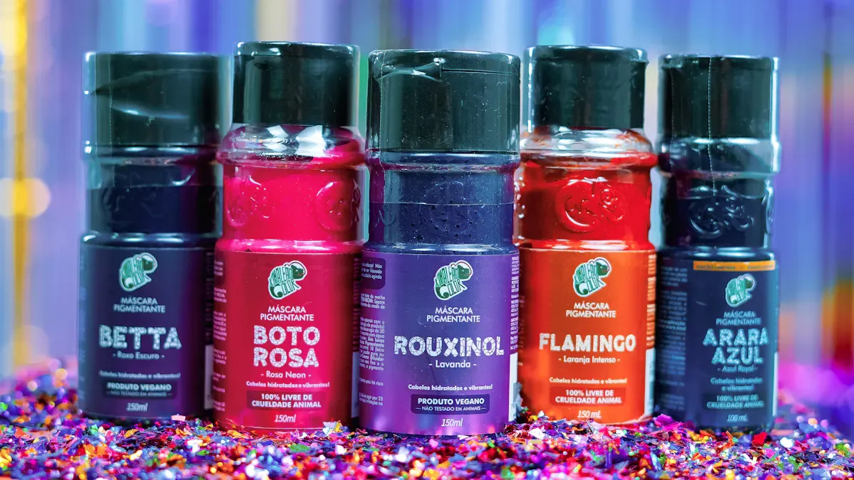
Warm colors are red, orange, and yellow. These colors can make you feel happy or excited. Red stands out and makes you want something. That is why many lipsticks and blushes are red. Orange feels fun and full of energy. It is good for products that want to look fresh. Yellow makes you think of happiness and hope. It works well for skincare that wants to brighten your mood.
Cool colors are blue, green, and purple. These colors help you feel calm and safe. Blue makes you think of things that are clean and pure. That is why many cleansers and toners use blue. Green reminds you of nature and being gentle. Brands use green for clean beauty and eco-friendly items. Purple feels fancy and a little mysterious. It is used for expensive creams and serums.
Neutrals are white, black, and gray. These colors look simple and classy. White means pure and natural. Black shows power and high quality. Gray is flexible and liked by many people.
Did you know? More than 70% of people say color is very important when they buy something. Brands use color to show who they are and what they believe.
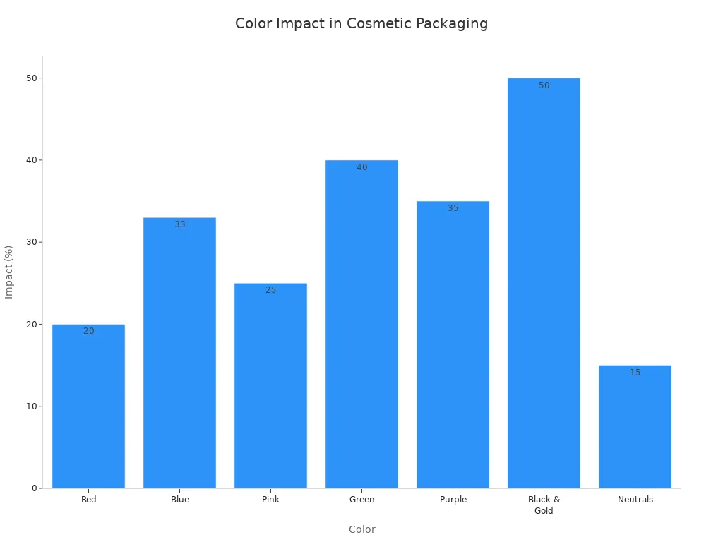
Here is a table that shows how colors can change your feelings and sales in cosmetic packaging:
| Color | Psychological Impact | Supporting Data |
|---|---|---|
| Red | Makes you want the product and notice lip items | Makes people buy on impulse 20% more |
| Blue | Feels calm and clean | Makes people think it is cleaner by one-third |
| Pink | Feels girly and fun | 25% more sales to millennials |
| Green | Feels natural and gentle | 40% more trust in clean beauty |
| Purple | Feels fancy and mysterious | 35% higher price accepted |
| Black & Gold | Feels elegant | 50% higher value |
| Neutrals | Feels simple and liked by many | 15% more sales |
Consumer Perception and Buying Behavior
You judge products quickly by their color. Almost 90% of your first thoughts come from color. Cosmetic packaging uses color to send messages to your senses. If you see a red lipstick, you might feel excited and want to buy it fast. Blue packaging makes you trust the product and think it is safe.
Studies show color helps you sort products and remember them. Pink packaging is popular with young people and helps sell more. Green packaging makes you trust natural and clean beauty items. Black and gold make you think of fancy and expensive things.
- 78% of people say color makes them want to buy.
- Brands pick colors to make you feel a certain way.
- Light colors mean pure and natural.
- Dark colors show strength and high quality.
You react to these colors even if you do not notice. Color psychology helps brands make you want their products and feel connected. When you pick up a cosmetic item, the color tells you what to expect and how to feel.
- Color changes how you see products and where they belong.
- Red makes you feel like buying right away.
- Blue makes you feel calm and safe.
- Almost 90% of quick choices are because of color.
Cosmetic packaging is more than just a box or bottle. It uses color psychology to help you choose and remember products.
Key Colors and Brand Image
Black, White, and Neutrals
You see black, white, and neutral colors everywhere in beauty packaging. These shades look clean, modern, and timeless. They send a message of simplicity and trust. When you pick up a product with these colors, you often feel it is safe and high quality. Many brands use these shades to show their focus on wellness or luxury.
- The Ordinary uses a simple design with black text on a white background. This makes you think of clean ingredients and honest formulas.
- Fenty Beauty uses neutral tones with metallic touches. This style feels modern and appeals to many people, no matter their skin tone.
- Goop keeps things minimal with soft, neutral colors. You get a sense of calm and wellness from their packaging.
These color associations help brands stand out and build trust with you.
Red, Pink, and Orange
Red, pink, and orange bring energy and warmth to cosmetic packaging. You notice these colors right away. They make you feel excited, happy, or playful. Brands use them to show passion, youth, or friendliness.
| Color | Association |
|---|---|
| Red | Energy and excitement |
| Orange | Warmth and enthusiasm |
| Pink | Femininity and playfulness |
Red works well for lipsticks and perfumes. It makes you think of boldness and passion. Pink feels gentle and romantic, perfect for skincare or products for young women. Orange gives off a friendly, fresh vibe, great for items that want to look fun and lively. When you see these shades, you feel drawn to try something new.
Blue, Green, and Purple
Blue, green, and purple create a sense of trust, calm, and luxury. Blue makes you think of cleanliness and professionalism. You often see it on skincare and shampoo bottles. Green stands for nature and eco-friendly choices. If you care about organic or clean beauty, green packaging speaks to you. Purple feels rich and special. High-end creams and palettes often use deep purple to show luxury.
Consumer research shows blue boosts trust and makes products feel pure. Green increases trust in clean beauty by 40%. Purple can even make you accept a higher price because it feels exclusive. These color associations help brands connect with your values and style.
Aligning Color with Product Label Design
Brand Positioning and Target Market
Choosing the right colors for your product label design can help you reach the right people. You want your cosmetic packaging to match your brand’s personality and speak to your target audience. Think about who you want to attract. Are you aiming for young, fun-loving buyers? Yellow works well because it feels bright and happy. Brands like Garnier use yellow for products with lemon extract to catch the eye of younger shoppers. If you want your product label design to feel calm and fresh, teal or turquoise can do the trick. These colors show peace and work great for daily use items, like Loreal Hydration. For a touch of elegance or to appeal to a younger, stylish crowd, purple and pinks are perfect. Kylie Cosmetics uses pink shades in their product label design to connect with younger fans.
When you plan your product label design, keep these points in mind:
- Pick colors that fit your brand’s message and values.
- Make sure your product label design matches what your target audience likes.
- Use colors that hint at what’s inside the package.
- Stand out from other brands by choosing unique shades.
- Think about the meaning of colors in different cultures.
A good product label design uses color psychology to connect with buyers and make your cosmetic packaging memorable.
Consistency and Recognition
You want people to remember your brand. That’s why color consistency in your product label design matters so much. When you use the same colors across all your cosmetic packaging, you build trust and make your products easy to spot. Research shows that color is a big part of how people recognize brands and feel about them. Bright colors like red and yellow grab attention, while blue and green can make your product label design feel calm or natural.
Beauty brands pick colors that match their brand story and what their customers like. If you keep your product label design consistent, you help shoppers feel connected to your products. This emotional link makes them more likely to choose your brand again. Your product label design should always reflect your brand’s core colors and style. This way, you create a strong, lasting impression in the market.
Tip: Use the same main colors in every product label design to boost brand recognition and build trust with your target audience.
A smart product label design, backed by target audience analysis, helps your cosmetic packaging stand out and keeps your brand top of mind.
Practical Tips for Cosmetic Packaging Colors
Simplicity and Cohesion
You do not need every color to make your packaging stand out. Simple designs are often the best choice. Using clean, neutral colors makes your products look fancy and clear. Minimalist packaging with soft or light colors can make your brand seem honest and special. This style helps your products get noticed on busy shelves. It also makes it easier for shoppers to find your brand.
- Simple colors stop confusion and help people choose fast.
- Using the same colors for all products builds trust and loyalty.
- Pastel colors can help shoppers feel calm, but bright colors give energy.
- When your products look alike, people remember your brand.
If you want your packaging to look modern and eco-friendly, use soft greens, whites, or beiges. These colors show you care about nature and good quality.
Color Pairing Strategies
Picking the right color pairs is important for getting attention. You can use color psychology to match your product’s mood. Warm colors like red and orange make things feel exciting. Cool colors like blue and green make things feel calm. Try using a bright color with a soft neutral for balance. High-contrast pairs, like black and gold, make your packaging look fancy and easy to see.
Here is a quick guide:
| Color Scheme | Emotional Impact | Product Type |
|---|---|---|
| Soft, Pastel | Calmness and serenity | Skincare products |
| Bold, Vibrant | Energy and vitality | Youthful cosmetics |
Look at what colors other brands use. If you see lots of pinks and reds, try a different color to stand out. Good color pairs help your products get noticed in a busy market.
Market Research Insights
Before you pick your colors, find out what your customers like. Market research can show which colors are liked by different ages or cultures. In the U.S., shoppers want brands that have choices for all skin tones and backgrounds. If you focus on including everyone, you will get better results and more loyal customers.
- Watch trends and see what is missing in stores.
- Ask your customers what colors they like most.
- Use facts and data to help you pick colors for new products.
Oulete can help you with custom color choices for any cosmetic packaging. You get expert advice, many materials, and stylish looks that fit your brand. With the right colors, you can make your brand stronger and help people choose your products.
You can see how color psychology helps cosmetic packaging work. It also helps brands do well. Studies say color affects almost 90% of quick buys. It also makes people remember brands 80% more. If you want people to feel close to your brand, use color to share your story. Color also helps your brand stand out from others.
Do you want packaging that matches your brand and what is popular? Oulete gives you custom color choices, special designs, and good quality for every material.
| Key Principle | Description |
|---|---|
| First Impressions Are Everything | Packaging changes how people first feel about a product. |
| Design Is Strategy | Every design choice shows what the brand is and affects what people buy. |
| Professional Design Pays Off | Good design helps people know your brand and can help sales go up. |
FAQ
What is color psychology in cosmetic packaging?
Color psychology is the study of how colors make you feel and act. In cosmetic packaging, brands use color to grab your attention, create emotions, and help you remember their products.
How does color affect my choice when buying cosmetics?
You often pick products based on color first. Bright or calm colors can make you feel excited, safe, or happy. Brands use this to help you trust them and want to buy their products.
Which colors work best for luxury cosmetic brands?
Luxury brands often use black, gold, or deep purple. These colors look elegant and expensive. They help you feel the product is high quality and special.
Can I use more than one color on my packaging?
Yes! You can mix colors for a unique look. Try pairing a bold color with a soft neutral. This helps your product stand out and keeps your brand style clear.
How can Oulete help with custom color packaging?
Oulete gives you expert advice and custom color choices. You get packaging that matches your brand and attracts your target customers. Oulete uses advanced technology to make sure your colors look great on every material.